
Hallo uilen en wolven, Leo hier. Today we will discuss the toolbar modifier in SwiftUI.
Last week was interesting for me, I had my first week of sponsorship and I could buy the holyswift.com domain. Since the beginning of this blog, I wanted to use the “.com” domain but it was too expensive to buy. Then, last week I was just browsing other domains to see their availability and then I tried holyswift.com which was very cheap. I couldn’t stop myself from buying it.
Also, last week brought me some lessons about building an iOS newsletter mailing list. Since the beginning of the blog, I was collecting new emails with just a banner in the blog, because the Hashnode platform does that too, so I thought that would be the best way to do it.
I thought “If this professional blogging platform is collecting leads using a banner in their blogs probably it works best” and I replicate that when I migrate to a self-hosted WordPress blog. Turns out that I was receiving around 5 to 7 new emails each week. One day, Pepijn my Dutch friend said to me “Hey Leo, you should have a newsletter” and I said, “Bro… I have a newsletter callout in a banner of the blog“.
At first, I thought that was my friend’s lack of attention problem but in reality, was just the banner blindness effect. So what I did was change the lead capture method. I started to implement a popup that would appear in the blog after X amount of seconds spent in the blog or X% of one page was viewed.
The experience was a success, I went from 5 to 7 new subscribers per week to 20 to 30 new subscribers per week. We are talking about an increase of 200% just by changing the location of the newsletter opt-in. I love to run experiences and hands-on discovery of new things, I would never imagine that a popup would be waaaay better to increase newsletter readers than the banner.
And now I can just exclude the newsletter banner from above the fold in the blog and I have a new space for advertisers a Win-Win situation!
Last week we talked about navigation bar color in SwiftUI and how to change them in all iOS versions, I thought that would be a great sequence to talk about another great feature of the navigation bars today, the navigation bars.
No more talking, let’s explore toolbars in SwiftUI. But first…
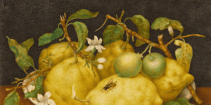
Painting of the Day
The 1905 art that I chose today is called Pencils, by Mikhail Vrubel.
He was born on March 17, 1856, and passed away on April 14, 1910. Most people see him as a Russian painter who was part of the Symbolist movement and Art Nouveau. But the interesting thing is, he didn’t really follow the trends of his time. Instead, his unique style was inspired by Late Byzantine and Early Renaissance paintings.
I chose this painting because of the pencils, and coal there. They are the tools of the artist when drawing things, and we will talk about toolbars today, got it?
The Problem
You want to customize the toolbar of your SwiftUI app.
In this article, we will explore a lot about the SwiftUI Toolbar API. The toolbar is very very important for SwiftUI navigation and not only navigation but also static views.
Let’s set up the minimum code for this article.
How to Create a Toolbar in SwiftUI?
To create a very basic toolbar, let’s use NavigationStack. Copy/paste the code below and let’s start our adventure:
struct ContentView: View {
var body: some View {
NavigationStack {
VStack {
NavigationLink {
Text("text")
} label: {
Text("Hello, world!")
}
}
.toolbar {
Text("Save")
}
.padding()
}
}
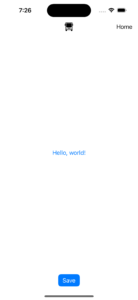
}The code above generates this view:
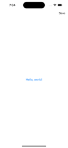
See that we have now a Text view in the top leading of the screen. By default, if you just add one view to your toolbar it will place in the top trailing we will learn how to change that later in this article.
Now you may be thinking “Well, a text is not that useful, would be great if I could add a button there!”. And you are totally right, let’s change the code to add a button instead of a plain old Text view.
How to Add Buttons to the Toolbar in SwiftUI?
To a button, you just need to replace the Text view with a button view.
Check the example below:
struct ContentView: View {
    var body: some View {
        NavigationStack {
            VStack {
                NavigationLink {
                    Text("Detail")
                } label: {
                    Text("Hello, world!")
                }
            }
            .toolbar {
                Button("Save") {
                    print("save document")
                }
            }
            .padding()
        }
    }
}
Generating this:
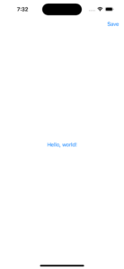
If you tap now in Save at the top it will print “save document” in your console. You can use that to interact with anything in SwiftUI it is very powerful, you can open modals, go to views, execute actions, and much more! Everything that a view can do, you can put in your toolbar now.
But the toolbar looks empty, right? Usually, it has a title and that is what we will do next.
How to add a Title to the Toolbar in SwiftUI?
To add a title to your toolbar you can use the navigationTitle modifier.
Copy the view below:
struct ContentView: View {
var body: some View {
NavigationStack {
VStack {
NavigationLink {
Text("Detail")
} label: {
Text("Hello, world!")
}
}
.toolbar {
Button("Save") {
print("save document")
}
}
.padding()
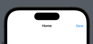
.navigationTitle("Home") // add this!
}
}
}And it will appear like this:
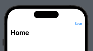
The title has some customizations that we can do. The above title is called Large title and it is the default for the navigation stack. However, you may like don’t have such a huge title on your screen and prefer the inline version.
How to Change the Toolbar Title Size?
You can change that using the navigationBarTitleDisplayMode modifier. In that modifier you can specifically say what type of title you want, the inline, the large, or automatically chosen for you.
Add the code below and let’s check our new view:
struct ContentView: View {
var body: some View {
NavigationStack {
VStack {
NavigationLink {
Text("Detail")
} label: {
Text("Hello, world!")
}
}
.toolbar {
Button("Save") {
print("save document")
}
}
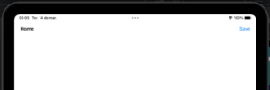
.navigationBarTitleDisplayMode(.inline)
.navigationTitle("Home")
.padding()
}
}
}The inline toolbar title is smaller and centered by default:
There is one more thing about titles that I want to explore, and that is the toolbar roles.
How to use the Toolbar Roles in SwiftUI?
The toolbar role configures the semantic role for the content populating the toolbar and in the current version of SwiftUI 4 we can only see differences in that using iPad.
Copy and paste the code below and open see the difference in the positioning of the title:
struct ContentView: View {
    var body: some View {
        NavigationStack {
            VStack {
                NavigationLink {
                    StructToolbarItemGroupView()
                } label: {
                    Text("Hello, world!")
                }
            }
            .toolbarRole(.browser) // add this!
            .toolbar {
                    Button("Save") {
                        print("save document")
                    }
            }
            .navigationBarTitleDisplayMode(.inline)
            .navigationTitle("Home")
            .padding()
        }

    }
}
Addin the browser toolbar role, the result in the iPad is:
Observe that the title is not in the center anymore it is on the trailing side. And this is very useful when you don’t want to use other customization techniques.
Now we will dive a little more deeply into those customization techniques.
How to Customize Complex Toolbar in SwiftUI?
Imagine that you want your title on the trailing side, an image in the center, and a button on the leading side, what would you do?
No worries, iOS 14 came with a really interesting way to customize your toolbar.
If you keep adding items in your toolbar like this:
.toolbar {
Button("Save") {
print("save document")
}
Button("Delete") {
print("delete document")
}
Button("Search") {
print("search document")
}
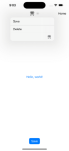
}You will end up with all of them stacked on the leading side of your toolbar by default:
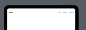
And maybe that is what you want. If you just want to add various buttons to your toolbar, yeap, your job is done here. But that wasn’t our goal, right?
To execute the customization we planned we need something else, and that is called ToolbarItem.
Using ToolbarItem to Customize the Toolbar
The ToolbarItem as you can figure it out is the object that holds a view that will be placed in the toolbar. And the special thing about them is that you can add a placement for your views in the toolbar. You can have various placements such as navigationBarTrailing, principal which is the center in the default toolbar role, navigationBarLeading, etc.
Check the example below:
struct ContentView: View {
    var body: some View {
        NavigationStack {
            VStack {
                NavigationLink {
                    StructToolbarItemGroupView()
                } label: {
                    Text("Hello, world!")
                }
            }
            .toolbar {
                ToolbarItem(placement: .navigationBarTrailing) {
                    Text("Home")
                }

                ToolbarItem(placement: .principal) {
                    Image(systemName: "bus")
                }

                ToolbarItem(placement: .navigationBarLeading) {
                    Button("Save") {
                        print("delete document")
                    }
                }
            }
            .navigationBarTitleDisplayMode(.inline)
            .navigationTitle("Home")
            .padding()
        }
    }
}
Resulting in this:
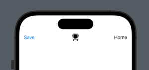
Really different toolbar isn’t it?
If you have three items like that but in the same position you can just use ToolbarItemGroup to group them! And then you don’t need to use various ToolbarItems, you could use just one ToolBarItemGroup.
And there’s more, the placement of the ToolbarItem is so flexible that you can have also them in the bottom bar. Changing the save button from leading to the bottom bar:
ToolbarItem(placement: .bottomBar) { // change the placement here!
    Button("Save") {
        print("delete document")
    }
}
Now we have the bottom bar ready with a save button!
Warning: If your toolbar role is set to something different than the default, the order and the placement of the toolbar items are not the same. To fix that just change the toolbar role when necessary.
Everything looks nice but I think our view is becoming a little bit cluttered, let’s use something that I learn recently to make the view look better.
How to use ToolbarContent Protocol to simplify your Views.
As the toolbar capability grows, also grows the code necessary inside it. Our toolbar is pretty simple and it is already with 14 lines of code, imagine if was a real-world scenario. We can use the ToolbarContent protocol to make the view easier to read.
Check the code below:
struct ContentView: View {
    var body: some View {
        NavigationStack {
            VStack {
                NavigationLink {
                    StructToolbarItemGroupView()
                } label: {
                    Text("Hello, world!")
                }
            }
            .toolbar {
                HomeToolbar()
            }
            .navigationBarTitleDisplayMode(.inline)
            .navigationTitle("Home")
            .padding()
        }
    }
}

struct HomeToolbar: ToolbarContent {
    var body: some ToolbarContent {
        ToolbarItem(placement: .navigationBarTrailing) {
            Text("Home")
        }

        ToolbarItem(placement: .principal) {
            Image(systemName: "bus")
        }

        ToolbarItem(placement: .bottomBar) {
            Button("Save") {
                print("delete document")
            }.buttonStyle(.borderedProminent)
        }
    }
}
The output should be exactly the same as earlier.
Create a Native Menu Directly From the Toolbar
Using toolbarTitleMenu you can create a native menu that will appear on the side of the principal item of your toolbar. This is another way to insert a menu in your toolbar.
Check the example below when we add two buttons and one image to the menu:
struct ContentView: View {
    var body: some View {
        NavigationStack {
            VStack {
                NavigationLink {
                    Text("HALLO!")
                } label: {
                    Text("Hello, world!")
                }
            }
            .toolbar {
                HomeToolbar()
            }
            .toolbarTitleMenu { // ADD THIS!
                Button("Save") {
                    print("save document")
                }.buttonStyle(.borderedProminent)

                Button("Delete") {
                    print("delete document")
                }.buttonStyle(.borderedProminent)

                Image(systemName: "bus")
            }
            .toolbarColorScheme(.light, for: .navigationBar)
            .navigationBarTitleDisplayMode(.inline)
            .navigationTitle("Home")
            .padding()
        }
    }
}
Resulting in the appearance of the arrow and if you tap it you will see:
Cool, right?
Now let’s go to our already a classic session about interview questions!
SwiftUI Toolbar Interview Questions
Let’s list some possible quick interview questions regarding SwiftUI toolbars.
Q: What is a toolbar in SwiftUI?
A: A toolbar in SwiftUI is a UI component that provides quick access to frequently used actions or functions within an app. It typically appears at the top or bottom of the screen and contains buttons or icons that represent various tasks.
Q: How do I add a toolbar to my SwiftUI view?
A: To add a toolbar to a SwiftUI view, use the .toolbar modifier on your view, and then add toolbar items using the ToolbarItem view.
Q: How do I control the placement of toolbar items?
A: You can control the placement of toolbar items by specifying the placement parameter when creating a ToolbarItem. Some common placements are .navigationBarLeading, .navigationBarTrailing, .bottomBar, and .principal. The system will automatically adjust the placement of toolbar items based on the available space and the platform’s design guidelines.
Q: Can I add custom views to my toolbar?
A: Yes, you can add custom views to your toolbar by creating a view and then embedding it inside a ToolbarItem.
Q: How can I control if the toolbar will be shown in the light or dark mode?
A: You can use toolbarColorScheme to control light and dark mode like the example below:
struct MyDarkColorSchemeView: View {
    var body: some View {
        VStack {
            Image("star")
                .resizable()
        }
        .toolbarColorScheme(.dark, for: .navigationBar) // add this for navigation bar
        .navigationTitle("My Star")
    }
}
Q: How do I create a toolbar that adapts to different platforms and devices?
A: You can create a responsive toolbar by using the ToolbarItemGroup view, which automatically adapts the layout of toolbar items to different platforms and devices. You can also use the @Environment(\.horizontalSizeClass) and @Environment(\.verticalSizeClass) property wrappers to access the current size class and make adjustments accordingly.
Also you can use techniques from this article to setup various enviroments for your code. This way for example, in staging and development you can have a helper Toolbar to setup things easily in your code.
Q: Is it possible to hide or show toolbar items based on certain conditions?
A: Yes, you can conditionally hide or show toolbar items by using SwiftUI’s standard conditional views, such as if statements or ForEach, inside the .toolbar modifier.
Q: Can I use a toolbar in a modal view?
A: Yes, you can use a toolbar in a modal view by adding the .toolbar modifier to the view that’s being presented modally. The toolbar will automatically adapt its appearance and behavior based on the context in which it’s being used.
Q: How do I handle accessibility in toolbars?
A: To make your toolbar items accessible, provide meaningful labels for your buttons and any custom views. You can use the .accessibilityLabel(Text) modifier to add an accessibility label to a view.
Q: Can I add a search bar to a toolbar in SwiftUI?
A: Yes, you can add a search bar to your toolbar by using the SearchBar view introduced in iOS 15.
import SwiftUI

struct ContentView: View {
    @State private var searchText = ""

    var body: some View {
        NavigationStack {
            Text("Hello, World!")
                .toolbar {
                    ToolbarItem(placement: .navigationBarLeading) {
                        SearchBar("Search", text: $searchText)
                    }
                }
        }
    }
}
Q: How do I customize the appearance of my toolbar?
A: You can customize the appearance of your toolbar by using view modifiers on the individual toolbar items, such as .font(), .foregroundColor(), and .background(). If you need to apply a consistent style across all toolbar items in your app, you can create a custom ButtonStyle and use the .buttonStyle() modifier on your toolbar buttons.
Q: How do I add spacing between toolbar items?
A: You can add spacing between toolbar items by embedding them within a container view, such as an HStack, and using the .padding() or .spacing() modifiers. For example:
ToolbarItem(placement: .navigationBarTrailing) {
    HStack(spacing: 20) {
        Button(action: {
            // Action for first button
        }) {
            Image(systemName: "plus")
        }

        Button(action: {
            // Action for second button
        }) {
            Image(systemName: "trash")
        }
    }
}
And that’s all for today!
Summary – SwiftUI Toolbar Walkthrough
In conclusion, the SwiftUI toolbar truly is a versatile and powerful component that can elevate your app’s user experience. By harnessing the power of toolbar items, custom views, and adaptive layouts, you can create a sleek and functional interface that caters to the diverse needs of your users across various platforms and devices.
SwiftUI’s innate ability to adapt and customize toolbars ensures that you can focus on delivering an enjoyable and efficient user experience without worrying about the complexities of different platform guidelines.
So, there you have it! A comprehensive look at SwiftUI toolbars, covering everything from the basics to advanced customization techniques. As you embark on your SwiftUI journey, remember to keep the user experience at the forefront of your mind, and experiment with different layouts, designs, and accessibility features.
Fellow Apple Developers, that’s all.
I hope you liked reading this article as much as I enjoyed writing it. If you want to support this blog you can Buy Me a Coffee or say hello on Twitter. I’m available on LinkedIn or send me an e-mail through the contact page.
You can likewise sponsor this blog so I can get my blog free of ad networks.
Thanks for the reading and… That’s all folks.
Image credit: Featured Painting