
Hallo computers en projectoren, Leo hier. We are going to discover some of the alignment guides features in SwiftUI.
Today I had some nightmares. It is weird how those things are, right? Sleeping as it is, is a weird thing because one moment you are living and awake in the next just void. As I woke up in the middle of the night I started thinking about my old Pokemon card collection.
I collected Pokemon cards when I was young like almost all the boys from the ’90s generation. I was really into that, I had several boxes of cards, binders, and top loaders, you name it. The whole fiesta was there and when I was young I loved those cards. I had the full shinning set of Neo Genesis stored in my mom’s house in my home country and I thought it was a good idea to give a new home for them.
So the last time I came back to my mom’s house I got all my Pokemon cards and went to a store that I trusted to sell them. I had a bit of MTG and Yu-gi-oh too. All in all, I got 1k euros for everything which was an amazing deal since I was doing absolutely nothing with the cards. But… as you can see here the prices of the shinning Pokemon from Neo Destiny are valued at way more than 1k euros. I’m not saying they all were PSA 10s but for sure the amazing was not from my side, that is for sure.
From time to time I come to think about that trade that I made last year and for a long time, I had mixed feelings about that trade. On one side I’m thinking that as I was not using those cards it is good that now I can invest in other stuff that I use, but then my collector side appears and I regret a little about selling the cards. I have always been a collector, when I was young I had several collections, mechanical pencils, Heroclix, rocks, CDs, DVDs, etc.
In the end, although I have dear memories with my father and I going to buy all those cards, having time together, etc. I think what I miss the most is the collecting feeling itself which is forever gone because now I have different priorities. I think its all nostalgia talking in my head.
Also some people liked that I shared what I was listening last week, so this week’s recommendation will be the Symphony Nº 3 by Brahms. This interpretation of the legendary Maestro Leonard Bernstein, brightess the fact that the symphony was composed during a summer holiday in Wiesbaden, at a time when Brahms was at the height of his musical powers and popularity. The serene and picturesque environment may have influenced the symphonic textures and emotional subtleties found in the work.
We can continue talking collections and music later because today is about alignment guides in SwiftUI.
The last article was about one of my curiosities of a very common annotation used in testing that I was not completely sure how it worked, the @testable annotation. Which is a nice way to break the access control modifiers from modules.
And if you are interested in accessibility for your apps ( and you should ), I’ve also wrote about a nice feature of the new Xcode 15 that is auditing accessibility for you! Check it out here!
No more talking, let’s code! But first…
Painting of The Day
The name of this painting is Winter Carnival, it is a 1985 piece made by Andrew Wyeth.
In 1948, Wyeth’s “Christina’s World” gained fame, depicting a polio-affected friend crawling across a field. Known for blending landscapes with portraiture, his notable works include “Trodden Weed” and “The Carry.” Wyeth, who preferred familiar subjects from his vicinity, was celebrated for his detailed realism but faced criticism for not being avant-garde. Which is ironic, right? Each artist should be criticed by what he chose, not by what he didn’t chose to follow.
His exhibitions attracted vast audiences globally and earned him significant accolades, including the Presidential Medal of Freedom in 1963 and the Congressional Gold Medal in 1990, making him the first artist to receive the latter.
I chose this painting because it depicts in the background two paths that reminded me the alignment guides.
The Problem – What are Alignment Guides in SwiftUI?
You want to align views without using spacers all the time and you want to understand the alignmentGuide modifier in SwiftUI
Let’s start a new Xcode project and add two rectangles to a VStack. Check the code below:
struct ContentView: View {
    var body: some View {
        VStack() {
            Rectangle()
                .frame(width: 50, height: 200)

            Rectangle()
                .foregroundStyle(.blue)
                .frame(width: 100, height: 100)
        }
        .padding()
        .border(.red)
    }
}
This will create a vertical stack of two rectangles, like the image below:
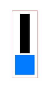
Observe that all the rectangles are centralized in the VStack because the default alignment of a VStack is Center. That means if we want all the views inside a VStack to be aligned to the left ( counting that you are reading in a left-to-right region) you can add the alignment modifier to the whole VStack.
For some views I’ll add the .border(.red) modifier so you we can check the exact size of each one of them.
Check the code below:
VStack(alignment: .leading) { // add here the alignment modifier
            Rectangle()
                .frame(width: 50, height: 200)

            Rectangle()
                .foregroundStyle(.blue)
                .frame(width: 100, height: 100)

        }
        .padding()
        .border(.red)
What this will do is say: “For all the views inside the VStack, the leading of each view will match the leading of the VStack. In other words, all the views leadings will be equal the VStack leading guide”. Check the image below: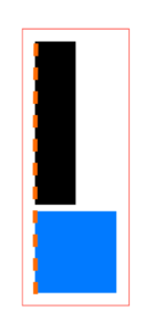
I drew an line orange to show the leading alignment guide from VStack, and that is where all the views are aligned now. In the same way if you had added the .trailing modifier to VStack, ever
So now you know that you can use VStacks to align views to the left or right, in a whole container. Another thing is that we also have alignment guides for other containers such as HStacks and ZStacks, and as you can imagine they are quite different than the VStack. For example the HStack instead of having leading or trailing modifiers, we have top and bottom ones because in the HStack case doesn’t make sense to align in terms of horizontal guides. So maybe that would be nice if you want to explore those before coming back to this article.
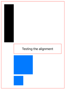
Lets add some more views to our VStack now. We will add a text and one more square. Check the code below:
struct ContentView: View {
var body: some View {
VStack(alignment: .leading) {
Rectangle()
.frame(width: 50, height: 200)
Text("Testing the alignment")
.frame(width: 250)
.padding(.vertical)
.border(.red)
Rectangle()
.foregroundStyle(.blue)
.frame(width: 100, height: 100)
Rectangle()
.foregroundStyle(.blue)
.frame(width: 50, height: 50)
}
.padding()
.border(.red)
}
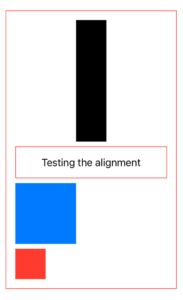
}Check it out:
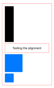
As you can see, all the views inside the VStack are aligned to the leading guide of it.
In the image above, something interesting to notice is the text inside the Text is by default aligned to the center of the view. So by default, the text inside the Text view will not follow the outer alignment guide if the frame is bigger than the text, there’s two ways to fix that. One is to remove the frame modifier and make the view only use the size that it needs or you can use the alignment option of the frame modifier like the excerpt below:
Text("Testing the alignment")
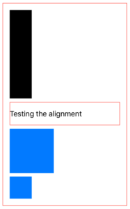
.frame(width: 250, alignment: .leading)Generating the following result:
But what if we want to change the alignment guide for the views to be relative to another view inside the VStack. For example, you want that the Text view leading start at the trailing of the first black rectangle, how you do that?
Alignment Guides SwiftUI Modifier – Usages and Caveats
So to do that we need to use the alignmentGuide modifier. Check what Apple wrote to us:
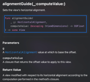
In my honest opinion this is really well technically written. But I can understand if you don’t get at first. In other words this is saying: You will provide two things, one is the horizontal alignment base value, the second is the offset value that we will apply on that base value. That’s it.
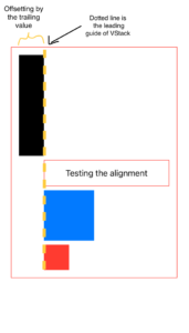
This way if we want that all the views, starting from the second have the leading alignment guide as the end of the first black square you can do like this:
struct ContentView: View {
    var body: some View {
        VStack(alignment: .leading) {
            Rectangle()
                .frame(width: 50, height: 200)
                .alignmentGuide(.leading, computeValue: { dimension in // add this!
                    dimension[.trailing]
                })

            Text("Testing the alignment")
                .frame(width: 250)
                .padding(.vertical)
                .border(.red)

            Rectangle()
                .foregroundStyle(.blue)
                .frame(width: 100, height: 100)

            Rectangle()
                .foregroundStyle(.blue)
                .frame(width: 50, height: 50)

        }
        .padding()
        .border(.red)
    }
}
Check the result of our new modified version:
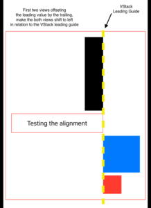
What is happening here?
The alignmentGuide modifier is modifying ( offsetting ) the leading value to the trailing. The return of dimension[.trailing] inside the alignmentGuide modifier is a float value, and that value is used to offset all the view. Let me draw some lines for you so maybe that became easier to understand:
When you use the offset() modifier, the actual dimensions of the text stay the same, even if it appears in a different spot. In contrast, if we had moved the first text view by offsetting it instead of altering its alignment guide, the VStack wouldn’t have stretched to include it.
But as we are using alignmentGuide the VStack size is changing, and this is very important to notice when using this.
With the explanation above you can understand what happens if you add several alignment guides. For example, if the first two views of our VStack have the alignmentGuides modified like the code below:
struct ContentView: View {
    var body: some View {
        VStack(alignment: .leading) {
            Rectangle()
                .frame(width: 50, height: 200)
                .alignmentGuide(.leading, computeValue: { dimension in // the trailing value of this view will also be glued to leading dimension of the view
                    dimension[.trailing]
                })

            Text("Testing the alignment")
                .frame(width: 250)
                .padding(.vertical)
                .border(.red)
                .alignmentGuide(.leading, computeValue: { dimension in // the trailing value of this view will also be glued to leading dimension of the view
                    dimension[.trailing]
                })

            Rectangle()
                .foregroundStyle(.blue)
                .frame(width: 100, height: 100)

            Rectangle()
                .foregroundStyle(.red)
                .frame(width: 50, height: 50)

        }
        .padding()
        .border(.red)
    }
}
As you can imagine, the first two views trailing guide will be glued to the VStack leading guide, generating this:
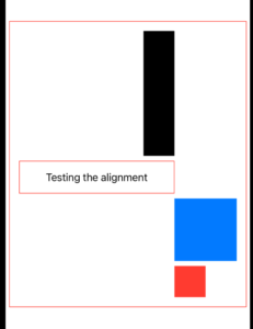
I’ll draw one more time the VStack leading alignment guide in a dotted yellow line for better comprehesion:
Very intersting right?
As you could check, every time that we add an offset for the leading guide, we are going towards the leading guide. Adding positive makes the views going left, but what happens if we return a negative Alignment Guide offset?
Negative Alignment Guides
In the same way, if we want to get away from it, we just need to return an negative value. Like the example below:
Rectangle()
    .frame(width: 50, height: 200)
    .alignmentGuide(.leading, computeValue: { dimension in
        -100
    })
The code above will push the view to the right as expected, because we are saying: “add an offset of 100 from alignment guide”.
The code above, using a .leading alignment guide in the VStack will result:
The black rectangle now is offset toward the right side of the view.
And that’s all that you need to know about alignment guides.
We are done!
Summary – SwiftUI Alignment Guides Tutorial
The exploration of alignment guides in SwiftUI showcases the powerful and flexible tools available to developers for managing layout in a more granular and precise manner.
Through the examples provided, we’ve seen how alignment guides can be manipulated to achieve desired layouts without resorting to spacers or complex offseting, or custom geometry readers. The ability to offset views relative to each other’s alignment points opens up a lot of possibilities for creating dynamic and responsive UIs.
As we go into the technicalities of SwiftUI, we’re also reminded of the importance of embracing change, whether in our hobbies, interests, or professional tools and techniques. The exploration of alignment guides, therefore, is not just a lesson in SwiftUI but a reflection on the journey of growth and adaptation in the ever-evolving world of technology.
Fellow iOS Developers, that’s all. I hope you liked reading this article as much as I enjoyed writing it.
If you want to support this blog you can Buy Me a Coffee or say hello on Twitter. I’m available on LinkedIn or send me an e-mail through the contact page.
You can likewise sponsor this blog and help our community to grow.
Thanks for the reading and…
That’s all folks.
Image credit: Featured Painting