
Hallo allemaal, Leo hier. Today we will explore the UI component called Accordion in SwiftUI.
The accordion component is a vertical stack (or a single one) of interactive headings, used to toggle the exhibit of further data, each item can be, therefore hidden with just a short title visible or shown to show the full content. This is a very common pattern and has several names in the front-end community.
They can be called: Title/Details section, Arrow toggle, Collapse, Collapsible sections, Collapsible, Disclosure, Expandable, Expander, and so on. As you could observe the front-end community is very creative when come to naming. It is important to maintain the same domain language to avoid miscommunication and at the end of the day, the important is to be sure that everyone has the same understanding of what is being discussed.
Accordions are useful to show content that is relevant to that flow without actually transferring the user to another modal or screen. Keep in mind to use it with caution. Imagine that you have a screen full of accordions, do you think that is the best user experience or maybe it should be replaced by more navigation screens? Or if your detail section of the accordion is too big, the user will have trouble hiding again making it waste precious interactions with your app.
No more talking, let’s code! But first…
The Painting of the Day
The painting I chose today is an 1890 painting called “Italian woman plays the accordion for her baby” by Giovanni Battista Torriglia.
Giovanni Battista Torriglia, a student at the Ligustica Academy of Fine Arts from 1875 to 1882, was, together with Angelo Vernazza and Luigi Gainotti, a pupil of Nicolò Barbino, “the ultimate master” whose workshop assistant he became after his studies.
The three pupils would later meet again in Nicolò Barbino’s studio, thus giving rise to a long friendship and collaboration that, as Vitaliano Rocchiero states, would be recognized in the “Barabinian School.”
I chose this painting because as we study today about the accordion, nothing is more suited than an accordion player to demonstrate it, right?
The Problem – Accordion in SwiftUI
You want to show an accordion in your SwiftUI app.
In iOS 14, Apple gave the developers the accordion UI component embedded in the SwiftUI framework. That was a relief because otherwise, you should do yourself that, or, use a third-party library. In the SwiftUI world, the accordion component is called DisclosureGroup and is defined by Apple as:
A disclosure group view consists of a label to identify the contents, and a control to show and hide the contents. Showing the contents puts the disclosure group into the “expanded” state, and hiding them makes the disclosure group “collapsed”.
And that is pretty much all that we have to say about this. In the next section let’s explore all the initializers that Apple provides to us using DisclosureGroups.
All Disclosure Group Initializers
The disclosure group initializers are divided into two groups, the ones that are initialized with Strings, and the others that are initialized with anything that conforms to the View protocol.
Three String Initializers
Let’s start with the first one where the title is made by using String.
Copy paste the code below:
struct ContentView: View {
var body: some View {
AccordionView()
}
}
struct AccordionView: View {
var body: some View {
VStack {
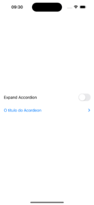
DisclosureGroup("The Title Of Accordion") {
VStack {
Image(systemName: "star")
Text("Lorem ipsum dolor sit amet, consectetur adipiscing elit. Aliquam sed mauris sit amet ex finibus suscipit. Nullam dapibus pulvinar eros, eget fringilla enim finibus ac. Nunc tempor sem in vehicula placerat. Nam vitae fermentum nisl. Proin dictum ligula vel interdum hendrerit. Curabitur maximus sollicitudin vehicula. Maecenas vestibulum vehicula viverra. Mauris vel dolor lorem. Nullam felis nulla, cursus sit amet nunc nec, venenatis mollis risus. Integer ut semper purus, a ullamcorper sem. Proin mattis facilisis est at molestie. Morbi lobortis hendrerit sapien sed fringilla. In volutpat nec libero ut consequat. Fusce placerat lectus odio, ac facilisis dolor egestas ac. Vestibulum porta elit et porttitor tincidunt. Ut imperdiet consectetur nunc sit amet scelerisque. ")
}
}.padding()
}
}
}Observe that the title is initialized using a pure String, in our case “The Title Of Accordion”. The body could be anything that can be translated to a view, in this example is a VStack with two views, one image, and one text.
The result is:
You can have a variant of this initializer that you to have more control if the Disclosure group is opened or closed.
String Initializer with Binding<Bool> Control
The second initializer we will show is the one that uses a Binding<Bool> that control the behavior of the Disclosure Group:
init(_ titleKey: LocalizedStringKey, isExpanded: Binding<Bool>, content: @escaping () -> Content)
To have that extra control and show how it works we will add a State variable and a Toggle control to show the view in Action.
Check the code below:
struct ContentView: View {
    var body: some View {
        AccordionView()
    }
}

struct AccordionView: View {

    @State var isAccordionExpanded: Bool = false

    var body: some View {
        VStack {
            Toggle("Expand Accordion", isOn: $isAccordionExpanded) // This contains an animation bug explained below
                .padding(.horizontal)

            DisclosureGroup("The Title Of Accordion", isExpanded: $isAccordionExpanded) {
                VStack {
                    Image(systemName: "star")
                    Text("Lorem ipsum dolor sit amet, consectetur adipiscing elit. Aliquam sed mauris sit amet ex finibus suscipit. Nullam dapibus pulvinar eros, eget fringilla enim finibus ac. Nunc tempor sem in vehicula placerat. Nam vitae fermentum nisl. Proin dictum ligula vel interdum hendrerit. ")
                        .onTapGesture { isAccordionExpanded.toggle() } // use this line if you want to close the Disclosure Group tapping in the text too.
                }
            }.padding()
        }
    }
}
Observe that now the isAccordionExpanded variable is bound to Toggle and the Disclosure Group. When you tap in the Toggle or in the title of the Disclosure Group the variable is toggled and the view is rendered again.
See the results below:
One thing that I noticed is when tapping on the disclosure group title the disclosure group opens and close with smooth animation, but when I use the Toggle switch to do that it just blinks the text on the screen.
To fix that you need to add “.animation()” to the binding inside the Toggle view.
Check below the fixed result:
struct ContentView: View {
    var body: some View {
        AccordionView()
    }
}

struct AccordionView: View {

    @State var isAccordionExpanded: Bool = false

    var body: some View {
        VStack {
            Toggle("Expand Accordion", isOn: $isAccordionExpanded.animation()) // THIS FIX the Disclosure Animation
                .padding(.horizontal)

            DisclosureGroup("The Title Of Accordion", isExpanded: $isAccordionExpanded) {
                VStack {
                    Image(systemName: "star")
                    Text("Lorem ipsum dolor sit amet, consectetur adipiscing elit. Aliquam sed mauris sit amet ex finibus suscipit. Nullam dapibus pulvinar eros, eget fringilla enim finibus ac. Nunc tempor sem in vehicula placerat. Nam vitae fermentum nisl. Proin dictum ligula vel interdum hendrerit. ")
                        .onTapGesture { isAccordionExpanded.toggle() }
                }
            }.padding()
        }
    }
}
Localized String Initializer
The last initializer to understand is the one that also works with “LocalizedStringKey” objects. It is not the scope of this article to guide you on how to add localization to your app but in a few steps you should:
- Go to project -> Info -> Localization and add support to the language that you want.

- Create a new “Localizable.strings” file or any other name because Localizable is just the default one.
- Click in the “Localizable.strings” and open the right-sidebar and find Localize button and click it.
- Check all the languages that you want to support.
- Add the key and the translation to each one of the files for each language. And you are done!
After you added your new translations you can use “LocalizedStringKey” object as the title for your Disclosure Groups.
Check the example below:
struct AccordionView: View {

    @Binding var isAccordionExpanded: Bool

    var body: some View {
        VStack {
            Toggle("Expand Accordion", isOn: $isAccordionExpanded.animation())
                .padding(.horizontal)
            DisclosureGroup("The-Accordion", isExpanded: $isAccordionExpanded) { // SwiftUI by default search for your keys in the localizable file and translate accordingly if needed
//          DisclosureGroup(LocalizedStringKey("The-Accordion"), isExpanded: $isAccordionExpanded) { this is the same thing as above, SwiftUI magic in Action.
                VStack {
                    Image(systemName: "star")
                    Text("Lorem ipsum dolor sit amet, consectetur adipiscing elit. Aliquam sed mauris sit amet ex finibus suscipit. Nullam dapibus pulvinar eros, eget fringilla enim finibus ac. Nunc tempor sem in vehicula placerat. Nam vitae fermentum nisl. Proin dictum ligula vel interdum hendrerit. ")
                        .onTapGesture { isAccordionExpanded.toggle() }
                }
            }.padding()
        }
    }
}
Resulting in:
And that was all the initializers with strings that we have available for now in iOS 16. Now, let’s check the other type of initializers.
The Label View Disclosure Group Initializer
For this type of initializer, the only difference is that it also accepts any objects that conform to the View protocol.
For example, if you want that your title would be made with three images centered you can.
Check the code below:
struct ContentView: View {
    var body: some View {
        AccordionView2()
    }
}

struct AccordionView2: View {
    var body: some View {
        VStack {
            DisclosureGroup {
                ForEach(0..<4) { _ in
                    Text("Hello, world!")
                }
            } label: {
                HStack(alignment: .center) {
                    Spacer()
                    Image(systemName: "lasso")
                    Image(systemName: "scribble")
                    Image(systemName: "paperclip")
                    Spacer()
                }
            }
        }
        .padding()
    }
}
This results in:
You can add literally anything as the title, while that conforms to the View protocol.
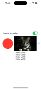
Shapes, images, let your imagination fly:
struct ContentView: View {
    var body: some View {
        AccordionView2()
    }
}

struct AccordionView2: View {

    var body: some View {
        VStack {
            DisclosureGroup {
                ForEach(0..<4) { _ in
                    Text("Hello, world!")
                }
            } label: {
                HStack(alignment: .center) {
                    Spacer()
                    Circle()
                        .frame(width: 100, height: 100)
                        .foregroundColor(.red)
                    Image("cat")
                        .resizable()
                        .scaledToFit()
                    Spacer()
                }
            }
        }
        .padding()
    }
}
Generating this result:

And the last Disclosure Group initializer to explore is the same as above but with more control from outside, I mean with the isExpanded controlled by a binding object. You can have a Binding<Bool> in your type to help you trigger the expansion or hidden behavior.
Let’s check that code:
struct ContentView: View {
    @State var isAccordionExpanded: Bool = false

    var body: some View {
        AccordionView2(isAccordionExpanded: $isAccordionExpanded)
    }
}

struct AccordionView2: View {
    @Binding var isAccordionExpanded: Bool

    var body: some View {
        VStack {
            Toggle("Expand Accordion", isOn: $isAccordionExpanded.animation())
                .padding(.horizontal)

            DisclosureGroup(isExpanded: $isAccordionExpanded) {
                ForEach(0..<4) { _ in
                    Text("Hello, world!")
                }
            } label: {
                HStack(alignment: .center) {
                    Spacer()
                    Circle()
                        .frame(width: 100, height: 100)
                        .foregroundColor(.red)
                    Image("cat")
                        .resizable()
                        .scaledToFit()
                    Spacer()
                }
            }
        }
        .padding()
    }
}
Photo here.
Resulting in:
One last thing. Text structure in SwiftUI is a View, so you can get the translations even if you are using this second type of initializer. That was all the Disclosure Group initializers, now is your time to test it and check for yourself.
And we are done for today!
Learn more SwiftUI
Is very cool what a simple API can do for our Apps did you know that you can create a toast view in SwiftUI and use it in UIKit? Learn how to do that in this article.
As we are talking about bridging stuff around for SwiftUI and UIKit, how about showing maps with new configurations in SwiftUI? The new MapKit API is only available for UIKit and in this article we study how to show new MapKit configurations with SwiftUI.
Summary – Accordion in SwiftUI
Today we studied five ways to implement the accordion UI component, which is called Disclosure Group in SwiftUI, in your projects. Which one are you going to use is up to you and your project needs.
We walked through examples of how to make Disclosure Group have images, shapes, and any kind of view as the title. And also solved the problem with the animation when using a Binding<Bool> to toggle the show or hiding behavior of the Disclosure Group.
Fellow developers, that’s all. I hope you liked reading this article as much as I enjoyed writing it. If you want to support this blog you can Buy Me a Coffee or just leave a comment saying hello. You can also sponsor posts! You can reach me on LinkedIn, or Twitter or send me an e-mail through the contact page.
Thanks for the reading and… That’s all folks.
Image Credit: Wikiart