Hallo fiets en auto’s, Leo hier. Today we will create a very simple Login Screen in SwiftUI.
First I have to tell a little tale. As I grew up and became more and more responsible for more things than just myself, I was becoming more and more cautious about the time I spent doing something. Especially in learning new stuff, optimizing your time is crucial when you don’t have the whole day or weekends for yourself.
Back in 2019, I was starting to learn Swift and building my first UI stuff, and ironically my first app was using SwiftUI. It is ironic because after that I started the 100 days of Swift by Paul Hudson and didn’t look to SwiftUI again until three months ago when in my current team we decided to use SwiftUI when possible.
Since then I started to study with more emphasis this new UI framework, and has been interesting all the findings. It really changes your perspective from UIKit, especially for the redraw behavior of Views in SwiftUI. While in UIKit you would say: “I want the button in this position relative to this and that”, in SwiftUI you say: “I want the button after this, or above that, or on top of that with this alignment”.
I’m fortunate to work in a company that invests in the development of continuous evolution of learning and now we are doing various courses with SwiftUI.
Grab your favorite tee (or coffee) and relax reading some SwiftUI code. But first…
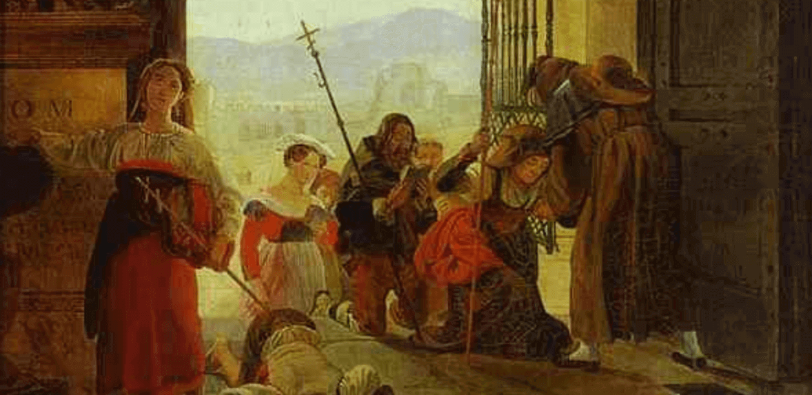
Painting of The Day
The painting chosen for today is an 1825 art piece called Pilgrims at the Entrance of the Lateran Basilica by Karl Bryullov.
Karl Pavlovich Bryullov lived from December 1799 to June 1852, original name Charles Bruleau, also wrote as Briullov or Briuloff and referred to by his companions as “The Great Karl”, was a Russian painter. He is regarded as a key figure in the transformation from Russian neoclassicism to romanticism.
An anecdote concerning Bryullov is shown in Leo Tolstoy’s essay “Why Do Men Stupefy Themselves?” and later in the same author’s essay “What Is Art?”.
I chose this painting because nowadays the entrance of a lot of internet places is the login screen, and since we will talk about login screen in SwiftUI today the painting was a perfect fit!
The Problem – Login Screen in SwiftUI
You want to create a simple Login Screen
Our login screen will have two conditions. One is to only enable the Sign In button when both fields are not empty and need to have a way to show the password to the user in the secure text field.
The final screen that we will build is this:
Let’s start!
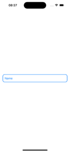
Building the Login TextField
The login text field is easy. It doesn’t have the problems of the password text field that involves more logic. But it doesn’t mean that we won’t have anything to learn here.
To build this component I had to ask some questions. “How to put the TextField in the middle of the screen in SwiftUI?“, was the first question. This is where start what I call “Spacer-based UI”, sometimes when I’m using SwiftUI the UI composition seems to be solved using Spacers, I don’t know if you already had that impression or is just me.
Check the code below:
struct ContentView: View {
    @State var name: String = ""

    var body: some View {
        VStack(alignment: .leading, spacing: 15) {
            Spacer() // this use all space available above the TextField

            TextField("Name", text: $name )
                .padding(10)

            Spacer() // this use all space available below the TextField
        }
    }
}
To put views in the middle of other views, or “centered”, usually you can just set a VStack or an HStack and put a pair of Spacers to make SwiftUI handle everything for you.
Now that our view is in the center of the screen in the Y axis, we want to add a rounded colored borderline to it. But how to add a colored border to a text field in SwiftUI? There are several ways to do it and we will use overlay.
Check it below:
TextField("Name", text: $name)
  .padding(10)
  .overlay {
     RoundedRectangle(cornerRadius: 10)
        .stroke(.blue, lineWidth: 2)
   }
   .padding(.horizontal)
The RoundedRectangle is a Shape. A shape by default will use all the available space to draw its shape. The good thing is, we can use just the outline of that shape using the stroke function and color that. And that’s exactly what we are doing here.
The last thing is something I had to do a lot in my previous job which is changing the placeholder of a text field in SwiftUI. How to change the placeholder color and attributes in SwiftUI?
Check the code below:
TextField("Name",
          text: $name,
          prompt: Text("Name").foregroundColor(.blue))
.padding(10)
.overlay {
    RoundedRectangle(cornerRadius: 10)
        .stroke(.blue, lineWidth: 2)
}
.padding(.horizontal)
To change that we can use the Prompt initializer of the TextField ( available only to iOS 15+) and change the color, font, or whatever other attribute we want from the Text.
The final result is this:
Now let’s start to build the password text field which will be a little more complex.
Building the Password Text Field
The password text field was more challenging. First, it involves three views, one Regular TextField, one SecureField, and an image view. The SecureField is the field that doesn’t show what the user tapped, this is very important for user safety, but sometimes on mobile, we aren’t so sure what we typed and want to give a quick look at what is in the text field exactly.
To do that we will create a Group and a State variable.
Check the code below:
struct ContentView: View {
@State var name: String = ""
@State var password: String = ""
@State var showPassword: Bool = false
var body: some View {
VStack(alignment: .leading, spacing: 15) {
Spacer()
TextField("Name",
text: $name ,
prompt: Text("Login").foregroundColor(.blue)
)
.padding(10)
.overlay {
RoundedRectangle(cornerRadius: 10)
.stroke(.blue, lineWidth: 2)
}
.padding(.horizontal)
HStack {
Group {
if showPassword { // when this changes, you show either TextField or SecureField
TextField("Password",
text: $password,
prompt: Text("Password").foregroundColor(.red)) // How to change the color of the TextField Placeholder
} else {
SecureField("Password", // how to create a secure text field
text: $password,
prompt: Text("Password").foregroundColor(.red)) // How to change the color of the TextField Placeholder
}
}
.padding(10)
.overlay {
RoundedRectangle(cornerRadius: 10)
.stroke(.red, lineWidth: 2) // How to add rounded corner to a TextField and change it colour
}
}.padding(.horizontal)
Spacer()
}
}
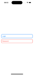
}Resulting in this:
You can use the Group to don’t need to repeat the padding and overlay, or any other configuration for each one of the views in it. This is how you can use a shortcut in SwiftUI to your View configurations. This way whichever view would be parsed inside the group would have the padding 10 and the rounded rectangle overlay. Cool, right?
Now let’s add the button at the password field right-side. But…
How to make the image change when tapped in SwiftUI?
Check the code below to get the answer:
HStack {
    Group {
        if showPassword {
            TextField("Password", // how to create a secure text field
                        text: $password,
                        prompt: Text("Password").foregroundColor(.red)) // How to change the color of the TextField Placeholder
        } else {
            SecureField("Password", // how to create a secure text field
                        text: $password,
                        prompt: Text("Password").foregroundColor(.red)) // How to change the color of the TextField Placeholder
        }
    }
    .padding(10)
    .overlay {
        RoundedRectangle(cornerRadius: 10)
            .stroke(.red, lineWidth: 2) // How to add rounded corner to a TextField and change it colour
    }

    Button { // add this new button
        showPassword.toggle()
    } label: {
        Image(systemName: showPassword ? "eye.slash" : "eye")
            .foregroundColor(.red)
    }

}.padding(.horizontal)
In SwiftUI as the view is just a function, every time the State changes it makes a diff of every view and redraws what is needed. In our case, it redraws the Image with the new image depending on what the boolean value “showPassword” is. Now let’s finish the screen with the button.
How to build a button with Gradient Background in SwiftUI
The last thing to add in our screen is the final button. Check the code below to learn how to do a gradient background in our buttons.
Button {
  print("do login action")
} label: {
  Text("Sign In")
  .font(.title2)
  .bold()
  .foregroundColor(.white)
}
.frame(height: 50)
.frame(maxWidth: .infinity)
.background(
   LinearGradient(colors: [.blue, .red],
                  startPoint: .topLeading,
                  endPoint: .bottomTrailing) // how to add a gradient to a button in SwiftUI
)
.cornerRadius(20)
.padding()
As you can observe in the code above, this is one of the several ways to add a gradient background to your SwiftUI views. The important thing to notice is the LinearGradient that let you select which colors you want to blend and the starting point and the end point of those colors.
Also, you can check how to build a button that uses and expands to all the space available using two .frame functions concatenated. I don’t know if this is the best way ( to me looks hacky), but this is the way I could achieve the right size of the button in the VStack.
The generated button is this:

Now we want to add two features to it. One is changing color when it is disabled or not, and the last is enabling the button if both of the fields are filled.
How to change the Color of a Button if Disabled in SwiftUI
To achieve those two behaviors we need to add one source of truth that will control if the button is disabled or enabled.
Add this control computed var to your code:
var isSignInButtonDisabled: Bool {
    [name, password].contains(where: \.isEmpty)
}
And in the button, we will use to manipulate the conditions of the background and disabled functions.
Button {
    print("do login action")
} label: {
    Text("Sign In")
        .font(.title2)
        .bold()
        .foregroundColor(.white)
}
.frame(height: 50)
.frame(maxWidth: .infinity)
.background(
    isSignInButtonDisabled ? // how to add a gradient to a button in SwiftUI if the button is disabled
    LinearGradient(colors: [.gray], startPoint: .topLeading, endPoint: .bottomTrailing) :
        LinearGradient(colors: [.blue, .red], startPoint: .topLeading, endPoint: .bottomTrailing)
)
.cornerRadius(20)
.disabled(isSignInButtonDisabled) // how to disable while some condition is applied
.padding()
The code above shows the two features we wanted to implement.
The first one is inside the background function we are selecting what color we want for the background based on the isSignInButtonDisabled variable. You can do whatever color you want with this trick, in our case when the variable is true the color is solid gray, but when enabled is a carnival-style gradient.
The last thing to notice here is the disabled function. There you can observe that we are using the same variable to change the color to be the source of truth to enable or not the button to be tapped. You can use any condition there, and that’s how you can disable a button in SwiftUI.
Full Code Example
Gluing everything together you will have this final code:
import SwiftUI

struct ContentView: View {

    @State var name: String = ""
    @State var password: String = ""
    @State var showPassword: Bool = false

    var isSignInButtonDisabled: Bool {
        [name, password].contains(where: \.isEmpty)
    }

    var body: some View {
        VStack(alignment: .leading, spacing: 15) {
            Spacer()

            TextField("Name",
                      text: $name ,
                      prompt: Text("Login").foregroundColor(.blue)
            )
            .padding(10)
            .overlay {
                RoundedRectangle(cornerRadius: 10)
                    .stroke(.blue, lineWidth: 2)
            }
            .padding(.horizontal)

            HStack {
                Group {
                    if showPassword {
                        TextField("Password", // how to create a secure text field
                                    text: $password,
                                    prompt: Text("Password").foregroundColor(.red)) // How to change the color of the TextField Placeholder
                    } else {
                        SecureField("Password", // how to create a secure text field
                                    text: $password,
                                    prompt: Text("Password").foregroundColor(.red)) // How to change the color of the TextField Placeholder
                    }
                }
                .padding(10)
                .overlay {
                    RoundedRectangle(cornerRadius: 10)
                        .stroke(.red, lineWidth: 2) // How to add rounded corner to a TextField and change it colour
                }

                Button {
                    showPassword.toggle()
                } label: {
                    Image(systemName: showPassword ? "eye.slash" : "eye")
                        .foregroundColor(.red) // how to change image based in a State variable
                }

            }.padding(.horizontal)

            Spacer()

            Button {
                print("do login action")
            } label: {
                Text("Sign In")
                    .font(.title2)
                    .bold()
                    .foregroundColor(.white)
            }
            .frame(height: 50)
            .frame(maxWidth: .infinity) // how to make a button fill all the space available horizontaly
            .background(
                isSignInButtonDisabled ? // how to add a gradient to a button in SwiftUI if the button is disabled
                LinearGradient(colors: [.gray], startPoint: .topLeading, endPoint: .bottomTrailing) :
                    LinearGradient(colors: [.blue, .red], startPoint: .topLeading, endPoint: .bottomTrailing)
            )
            .cornerRadius(20)
            .disabled(isSignInButtonDisabled) // how to disable while some condition is applied
            .padding()
        }
    }
}

struct ContentView_Previews: PreviewProvider {
    static var previews: some View {
        ContentView()
    }
}
Results in this screen:
And that’s all folks!
Continue Studying SwiftUI
Learning about SwiftUI has been a lot of fun and a lot of pleasant surprises. One of them is that we have embedded in the framework the Accordion style UI using disclosure groups. Check this article to learn more about that.
To dive deeper into SwiftUI is crucial to understand how and when views will redraw or not. To start studying that I recommend this tutorial on SwiftUI view redraws.
Summary – Login Screen in SwiftUI
Today we covered a lot in SwiftUI. We build custom buttons that change colors when are disabled. Learned how to create a text field that shows, or does not, the password depending on the user’s choice.
We also checked how to use the custom placeholder color for SwiftUI text field Views. And put everything together on one screen to create a good user experience.
Fellow developers, that’s all. I hope you liked reading this article as much as I enjoyed writing it. If you want to support this blog you can Buy Me a Coffee or just leave a comment saying hello. You can also sponsor posts! You can reach me on LinkedIn, or Twitter or send me an e-mail through the contact page.
Thanks for the reading and… That’s all folks.
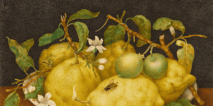
Image Credit: Wikiart