Hello Apple Fans, Leo here. Today I’ll present the new Apple collaboration tool called Freeform.
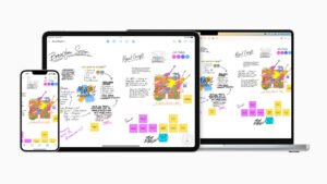
Apple has just launched Freeform, a powerful new app designed for creative brainstorming and collaboration. Freeform makes visual collaboration easier than ever before.
With its intuitive interface and powerful features, Freeform allows teams to quickly and easily generate and organize ideas, share and discuss them, and collaborate to turn them into actionable plans. Whether you’re working on a new marketing campaign, developing a product, or tackling any other creative project, Freeform is the perfect tool to help your team unleash its full potential.
As we published last week, it is not only third-party developers that create Apps for iPhone. Apple has a really great set of tools out of the box available. Not only, apps but also new infrastructure available to iPhone users with the new Satellite SOS feature in the new iPhones.
Let’s dive into this new Apple app today!

What is the New Freeform App from Apple?
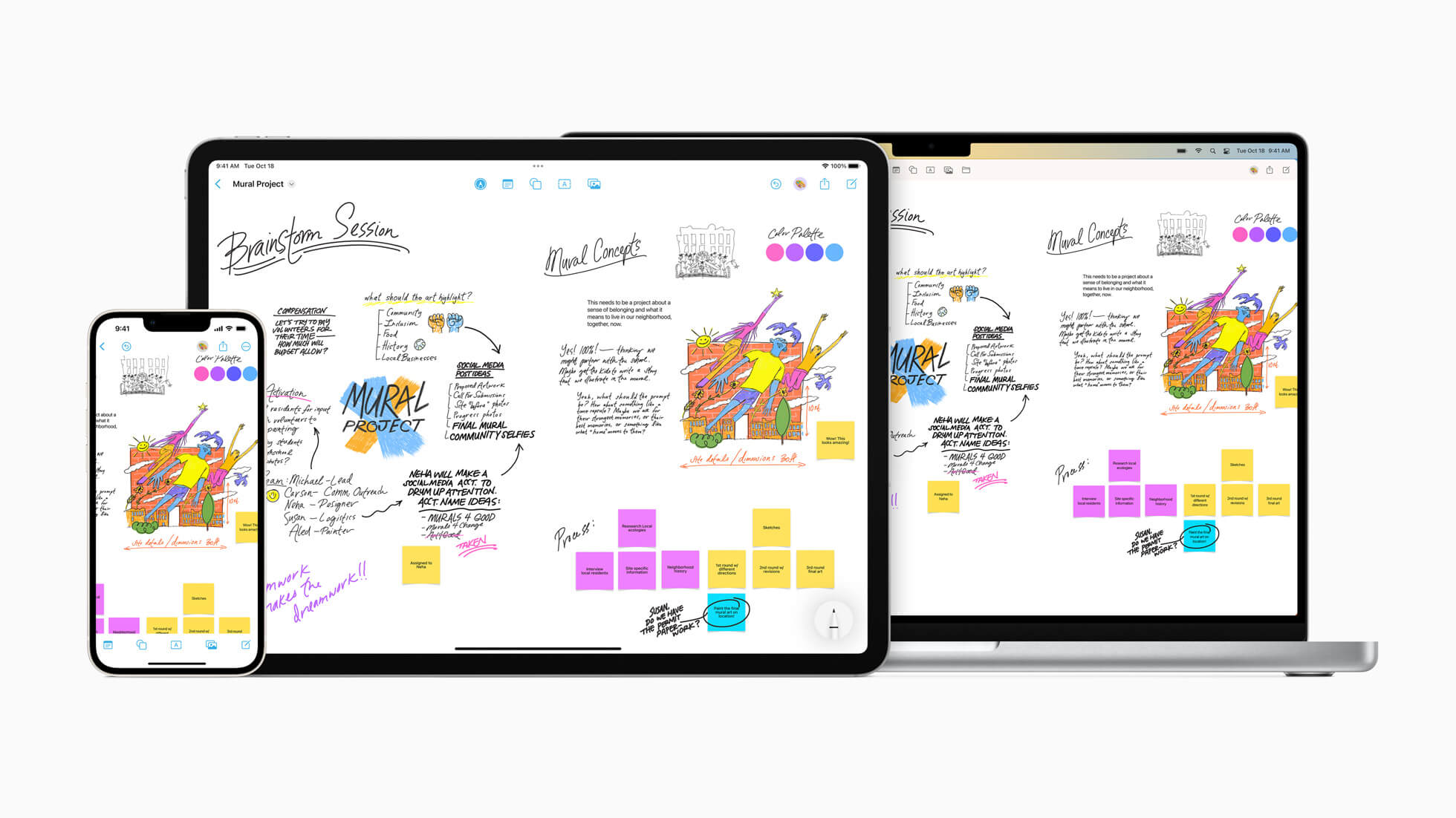
Freeform gives users the ability to see, share, and communicate all in one destination without worrying about layouts or page limits by assisting them in organizing and graphically organizing content on a flexible canvas.
Without ever leaving the board, users can add a wide variety of files and preview them inline. Freeform, which was created for collaboration, makes it simpler than ever to invite people to work on a board with you.
Let’s start a see the features.
Apple’s Freeform Welcome Screen
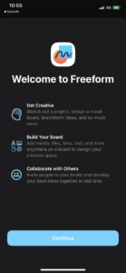
When you first open your app, you will see this screen:

I like how Apple does the onboarding screens. It is so simple and says a lot about what App does. Let’s appreciate this rare moment when Apple releases a fresh new app and we have the opportunity to gather information on how it onboards all new users for this new experience.
Dissecting the Design of the Onboarding Screen
The design decision here is amazing. It presents three pieces of information only, but of course, the app doesn’t only have three features. Let’s check what Apple decided to present to the user for the first time.
- Get Creative

In the first paragraph Apple makes clear WHAT is the intention behind the App, AKA the purpose/vision statement of it it is a form of Sketching/Designing/Brainstorming app. The icon chosen is not trivial here, the human brain. In the human brain lies the opposite of what the new AI trends have, we have creativity inside us.
Apple putting the human brain as the first icon for the features of a new App is a strong statement that your imagination and ability to think is still the main component for achieving success with Projects/Mood Boards/Ideas.
This looks subtle but now that AI is becoming more and more common in our days, it is very important to remember that your uniqueness is still wonderful.
- Build Your Board

The second paragraph is about HOW Apple intended to deliver ‘what’ was stated in the first paragraph. This is where things got more technical.
Apple here chose to build a plain list of things that you can add to your board. And even the icon shows that. We have icons for letters, images, files, and Safari itself. The icon talks perfectly with the subtitle adding to the newly introduced Board concept more powers than the user could predict.
By the way, it is interesting to notice that Apple put the word Board in all paragraphs, it wasn’t unintentional. Choosing the word ‘board’ to be highlighted in the title and appear in all the subtitles re-affirms the main tool that Apple will provide to you while using the App.
- Collaborate with Others

The last paragraph is featuring the WHO aspect of the App.
First, it stated what it does using creativity(the brain) as the fuel to use this app, then introduce the concept of the Board the main keyword of this whole presentation, and what you can add to it giving the sense of “Wow! I can do everything with this new tool“.
Lastly, Apple introduces who will use the board. And here is very interesting the emphasis on Others in the title. This is where Apple finishes the statement of the app, which is made to be used with others. An interesting thing to point out is that Apple is pushing the real-time designing capability as one of the main features of the App. But why?
Two things. First, focusing on the togetherness of the app, Apple reinforces and achieves what was intended from the beginning, becoming a real collaboration tool.
Second, my long-shot guess would be that Apple is betting on the viral use of this App. It is amazing when one user loves your App, but when your app is used by a group of users you start to get the viral effect. Because now you don’t have alone users loving your app, you have teams and communities of users that love your app and can spread and convince people to use it much more easily than any marketing campaign could do.
When and Where Freeform is Available?
Available for iOS 16.2 on iPhone, iPad, and Ventura MacOS, Freeform makes visual collaboration easier than ever before.
Freeform Features
The main Board screen is pretty simple. Check below what everything do:

- Number 1 is the undo button. Tap and you can undo whatever was the last action.
- Number 2 is the sharing button where you can Invite and enable the full collaboration potential of your board.
- This is a menu for board renaming, duplicating, making it a favorite, finding things with a word search, hiding the grid, exporting to PDF, and also printing the board. I personally don’t know who would print things nowadays, but the feature is there.
- The number 4 button is to easily start a new blank board file.
- The bottom bar button is to Add Things to the board. The five things that you can add now are: Post-its, Shapes (rectangles, circles, boats, ornaments, etc), Texts, Free drawing with pens/pencils/etc, Media that can be from Files/Links/Scan documents from the Camera/ Live Photos from the camera/ Photos and videos from the past.
Focus on Collaboration
Users can start a FaceTime call within Freeform by hitting the collaboration icon in the top right corner of the screen because FaceTime is already integrated into the software. With fast-sync features and iCloud connection, all collaborators may see each other’s contributions as they add content or change existing content. Freeform boards may be exported as a PDF or copied and pasted, and they are synchronized between iPhone, iPad, and Mac. Users can also invite people by email or a link.
By simply dragging a Freeform board into a Messages thread, users can invite others to a Freeform board, making use of the new collaboration features in Messages. The boards will instantly invite all players to that discussion, at which point they can start contributing right away. Activity updates will appear at the top of the Messages thread whenever someone makes an adjustment.
Summary – Freeform Collaboration Design Tool
Freeform is immensely helpful for solo tasks or while working with others, whether a user is at a desk or on the road. When working on group projects or even organizing a trip with friends, Freeform creates a shared space for creativity with the opportunity to collaborate with up to 100 contributors on the same board.
Fellow Apple Lovers, that’s all. I hope you liked reading this article as much as I enjoyed writing it. If you want to support this blog you can Buy Me a Coffee or say hello on Twitter. I’m available on LinkedIn or send me an e-mail through the contact page.
You can likewise sponsor this blog so I can get my blog free of ad networks.
Thanks for the reading and… That’s all folks.
Image credit: Featured Image


