Hallo vrienden en collega’s, Leo hier. Today we will learn the best way to styling components in SwiftUI, especially with ButtonStyle.
I’m having the opportunity to use SwiftUI intensively in my daily work. We are recreating a BIG chunk of the app with SwiftUI and we are finding our way through it. It has been really nice to work with SwiftUI so far and when everything works is really easy and smooth.
The only complaint I still have with SwiftUI is how it handles errors. I think that everyone that already written some lines with SwiftUI and knows that when an error happens only God knows what was the mistake because Xcode is not your friend anymore. In my daily development, I found faster just undoing things until the build is not broken any more than trying to understand the cryptic Xcode error messages.
To be honest I still like UIKit and to me, I find it more natural to write code with auto-layout constraints. However, I have to admit that I feel that SwiftUI is orders of magnitude faster than UIKit to write Views.
Recently I found myself in the middle of a problem that I didn’t about SwiftUI which is when you add observables inside observables. In that article, you can see the problem and how to solve it.
Another thing that is very important when we talk about SwiftUI is how to show API or any other kind of error to the users. We have several ways to show errors to the user and with that article, you can choose what is the best for your audience.
No more talking, let’s code! But first…
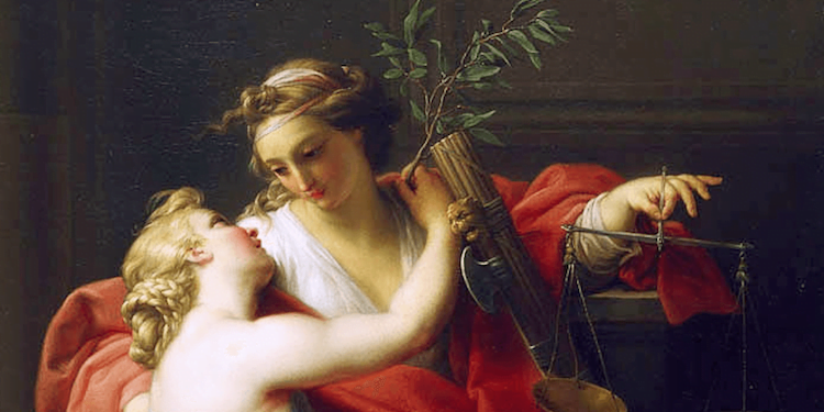
Painting of the Day
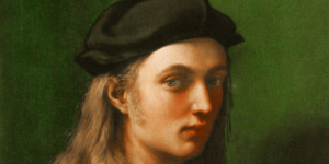
The art piece I chose today is called Peace and Justice a 1745 painting by Pompeo Batoni.
Batoni’s style took inspiration and incorporated elements of classical antiquity, French Rococo, Bolognese classicism, and the work of artists such as Nicolas Poussin, Claude Lorrain, and especially Raphael. As such Pompeo Batoni is considered a precursor of Neoclassicism.
And that is why I added this painting. Because we are talking about styling, when you add your custom button types to your app you will be the precursor of the style of your app, like Pompeo Batoni was for Neoclassicism. Interesting, right?
The Problem – Writing Generic Styles For Your SwiftUI Apps
You want to have a default style for buttons or labels throughout your app
This is something that all of us need to do eventually. A new designer comes to the company and wants to restyle all the components. If you didn’t create your buttons as custom buttons or applied a ButtonStyle protocol to your buttons you are in a bad position now. The good thing is that you will learn in this article how to solve your styling problems.
SwiftUI’s ButtonStyle protocol is a cool way to customize the look and feel of your buttons in your iOS app. Why settle for boring buttons when you can make them as stylish as your wardrobe?
With this protocol, you can change the appearance of your buttons, such as their background color, and font, or even add an animation effect when they’re pressed. This gives you more control over the user experience and allows you to create buttons that match the aesthetic of your app.
Another great thing about the ButtonStyle protocol is that it’s easy to use. All you need to do is create a custom struct that conforms to the ButtonStyle protocol and then apply that custom style to the buttons in your app. This can be done in just a few lines of code, and the best part is that you don’t have to worry about managing the button’s layout or behavior.
Another good news for all SwiftUI developers is that ButtonStyle is present since iOS 13, so anyone that has SwiftUI available can also use ButtonStyle too.
This makes it a great option for developers who want to customize their buttons without having to dive into the nitty-gritty details of UI design.
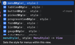
Views That Can be Natively Styled in SwiftUI
Some examples are:
- Toggle
- DisclosureGroup
- DatePicker
- Menu
- Gauge
- Form
- ProgressView
- Label
You have more of them. Just open your SwiftUI Xcode project and tap “.style” in any HStack or VStack that you will see the list:
One last thing about those modifiers is that they will apply to all subviews that the modifier is applied. For example: if you have a VStack with 3 buttons and you want to style all of them the same way you can put .buttonStyle(YourStyle) just in the VStack, instead of declaring that in each of the 3 buttons. Cool, right?
SwiftUI Button Style Example
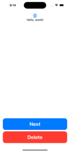
Start a new SwiftUI project and check the screen we will build:
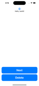
In this example we will build The style of the buttons on the bottom of the screen will be done by the ButtonStyle protocol.
Let’s create that:
struct DefaultButtonStyle: ButtonStyle {
    func makeBody(configuration: Self.Configuration) -> some View {
        let label = configuration.label

        HStack {
            Spacer()
            label
            Spacer()
        }
        .font(.system(.title, design: .rounded, weight: .bold))
        .foregroundColor(.white)
        .padding()
        .background {
            RoundedRectangle(cornerRadius: 15)
                .foregroundColor(.blue)
        }
    }
}
Above you can see how you can create the style for the buttons that we want. However, how to use it?
Well, it is very simple. You just need to add the .buttonStyle(DefaultButtonStyle()) to your view hierarchy and that’s it!
Check how to add that below:
struct ContentView: View {
    var body: some View {
        VStack {
            Image(systemName: "globe")
                .imageScale(.large)
                .foregroundColor(.accentColor)
            Text("Hello, world!")

            Spacer()

            Button("Next") {
                print("Go to the screen")
            }

            Button("Delete", role: .destructive, action: {
                print("Delete some code here.")
            })
        }
        .padding()
        .buttonStyle(DefaultButtonStyle()) // add the style here!
    }
}
But why the buttons are changed if I added just one “.buttonStyle()” modifier? Do you remember when I told you that it is not needed to add “.buttonStyle()” modifier in all views because the modifier embraces all the subviews within it?
That is exactly what we are doing here.
As the “.buttonStyle()” works for all subviews, all the buttons that are inside the VStack now have the desired style. Easy right?
Now you can run your app and you will see the two buttons with a new style!
Let’s explore more about custom button styles.
Comparing Before and After in the SwiftUI View Body Using Custom Style
If we weren’t using style or any other custom views, this would be the View var body code:
Before:
struct ContentView: View {
    var body: some View {
        VStack {
            Image(systemName: "globe")
                .imageScale(.large)
                .foregroundColor(.accentColor)
            Text("Hello, world!")

            Spacer()

            HStack {
                Spacer()
                Button("Next") {
                    print("Go to the screen")
                }
                Spacer()
            }
            .font(.system(.title, design: .rounded, weight: .bold))
            .foregroundColor(.white)
            .padding()
            .background {
                RoundedRectangle(cornerRadius: 15)
                    .foregroundColor(.blue)
            }

            HStack {
                Spacer()
                Button("Delete", role: .destructive, action: {
                    print("Delete some code here.")
                })
                Spacer()
            }
            .font(.system(.title, design: .rounded, weight: .bold))
            .foregroundColor(.white)
            .padding()
            .background {
                RoundedRectangle(cornerRadius: 15)
                    .foregroundColor(.blue)
            }
        }
        .padding()
    }
}
Now using “.buttonStyle()” modifier.
After:
struct ContentView: View {
    var body: some View {
        VStack {
            Image(systemName: "globe")
                .imageScale(.large)
                .foregroundColor(.accentColor)
            Text("Hello, world!")

            Spacer()

            Button("Next") {
                print("Go to the screen")
            }

            Button("Delete", role: .destructive, action: {
                print("Delete some code here.")
            })
        }
        .padding()
        .buttonStyle(DefaultButtonStyle())
    }
}
This started to give me ideas for a new module that I can add to my app with the styles for each one of the components. Or… maybe a lot of modules! Could be one for each View type, for example, ButtonStyleKit where we keep all the button styles for the whole app. Just food for thought… Let’s keep going.
Walkthrough Into ButtonStyle API in SwiftUI
The ButtonStyle protocol declares just one function:
That function receives a Configuration that is a ButtonStyleConfiguration object. Let’s check what we can do with it:
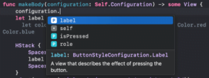
We can use three things here:
- Label: This is the object to that we will apply the style and all the changes that we need.
- isPressed: is a boolean that indicates… guess what? If the button is pressed or not. This will be useful for animating the interaction with the button.
- role: is optional that can contain a ButtonRole. The ButtonRole, nowadays, has two static lets one that is for cancel and another for destructive buttons.
Let’s use each one of them to make your buttons shine.
Adding Animated Responsiveness To Your Custom Layout
I’ve watched two talks about animations and responsiveness from Adam Bell. The talks are really good and I strongly recommend you watch them. We won’t implement a very sophisticated responsiveness mechanism with spring and real physics involved.
We will just add a little touch to it and the isPressed property of the button style configuration will help us with that.
The goal here is to get a visible response to the button when we press it. The plan is to every time the button is pressed we will shrink it a little bit, this way the user knows that he/she tapped the right button.
Modify the ButtonStyle code to add the .scaleEffect modifier to your buttons:
struct DefaultButtonStyle: ButtonStyle {
    func makeBody(configuration: Self.Configuration) -> some View {
        let label = configuration.label

        HStack {
            Spacer()
            label
            Spacer()
        }
        .font(.system(.title, design: .rounded, weight: .bold))
        .foregroundColor(.white)
        .padding()
        .background {
            RoundedRectangle(cornerRadius: 15)
                .foregroundColor(.blue)
        }
        .scaleEffect(x: configuration.isPressed ? 0.96 : 1, y: configuration.isPressed ? 0.96 : 1) // ADD THIS TO ANIMATE THE TOUCH!!!!
    }
}
Check the video below:
Way better! Right? This is how we can add very simple animated feedback for the user when he taps our buttons. I love when SwiftUI makes things simple.
Styling the Role of a Button
This might come to your mind: How to style different button Roles? The good thing is that we have an API for that.
You can also use the role property of the ButtonStyleConfiguration to change things in the style. For example, if you want to destructive buttons be red we could easily do it with the role property.
Check the implementation below:
struct DefaultButtonStyle: ButtonStyle {
    func makeBody(configuration: Self.Configuration) -> some View {
        let label = configuration.label
        let color = configuration.role == .destructive ? Color.red : Color.blue // using this you can chose what color your button will have

        HStack {
            Spacer()
            label
            Spacer()
        }
        .font(.system(.title, design: .rounded, weight: .bold))
        .foregroundColor(.white)
        .padding()
        .background {
            RoundedRectangle(cornerRadius: 15)
                .foregroundColor(color)
        }
        .scaleEffect(x: configuration.isPressed ? 0.96 : 1, y: configuration.isPressed ? 0.96 : 1)
    }
}
And the final result is:
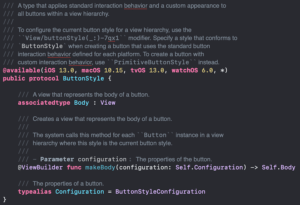
Difference between PrimitiveButtonStyle and ButtonStyle
The PrimitiveButtonStyle has two things, while ButtonStyle is just one.
PrimitiveButtonStyle applies custom interaction behavior and a custom appearance to all buttons within a view hierarchy. That means that you will need to handle the trigger of the button yourself, which brings more flexibility to your code. The PrimitiveButtonStyle is cool because we can create extensions and add our own style to the app looking very natural to use the API.
The same thing using PrimitiveButtonStyle could be done:
extension PrimitiveButtonStyle where Self == DefaultButtonPrimitiveStyle {
    static var defaultButton: DefaultButtonPrimitiveStyle {
        DefaultButtonPrimitiveStyle()
    }
}

struct DefaultButtonPrimitiveStyle: PrimitiveButtonStyle {
    func makeBody(configuration: Self.Configuration) -> some View {
        let label = configuration.label
        let color = configuration.role == .destructive ? Color.red : Color.blue

        return HStack {
            Spacer()
            label
            Spacer()
        }
        .font(.system(.title, design: .rounded, weight: .bold))
        .foregroundColor(.white)
        .padding()
        .background {
            RoundedRectangle(cornerRadius: 15)
                .foregroundColor(color)
        }
        .onTapGesture { // We need to implement the tap ourselves, because the PrimitiveButtonStyle don't give that for free.
            configuration.trigger()
        }
    }
}
In the code above, observe that different than the ButtonStyle the PrimitiveButtonStyle doesn’t have the default touch triggers and it is up to us to implement that the way we want. There are various ways you could achieve that so be careful with your implementation, if you just want to style your button you should go for ButtonStyle.
The good part is that now to use it we don’t need to instantiate a new style every time, we can just use the static var we created, like this:
struct ContentView: View {
    var body: some View {
        VStack {
            Image(systemName: "globe")
                .imageScale(.large)
                .foregroundColor(.accentColor)
            Text("Hello, world!")

            Spacer()

            Button("Next") {
                print("Go to the screen")
            }

            Button("Delete", role: .destructive, action: {
                print("Delete some code here.")
            })
        }
        .padding()
        .buttonStyle(.defaultButton) // here is the change. We don't need to instantiate because the static var is already in place.
    }
}
On the other hand, the ButtonStyle protocol changes the style of the view’s buttons to one with a unique appearance and has the default interaction patterns. With this one, you can only change the appearance of the button, not how or when it triggers the user interaction.
Why use ButtonStyle Instead of Creating a New Custom Button View?
Think about it. What do you need, a whole new Button view, or do you only need to style the good old default SwiftUI Button View?
If you answer the latter that is the main reason to not create a new view just for styling the button.
However, if you need to create a container View that also has a button but does other things and has some logic involved, you should probably create a new Custom Button View.
Don’t go straight to creating new Views when you just want to style the default ones. I made that mistake and now I have a lot to refactor.
Summary – How to use ButtonStyle in SwiftUI
In conclusion, the SwiftUI ButtonStyle protocol is a versatile and straightforward tool for customizing the look and feel of your buttons in your iOS app.
Whether you’re a seasoned developer or just starting out, this protocol can help you create buttons that are both functional and visually appealing. So if you’re looking to add a personal touch to your buttons, be sure to check out SwiftUI’s ButtonStyle protocol!
This article was only possible because was heavily inspired by this one by Kasper Lahti.
Fellow Apple Developers, that’s all. I hope you liked reading this article as much as I enjoyed writing it.
If you want to support this blog you can Buy Me a Coffee or say hello on Twitter. I’m available on LinkedIn or send me an e-mail through the contact page.
You can likewise sponsor this blog so I can get my blog free of ad networks.
Thanks for the reading and… That’s all folks.
Image credit: Featured Painting
